Financial Site Design
Timeline
October 2024, Requirements
January 2025, Content Design
March 2025, Implementation
June 2025, Launch
My Role
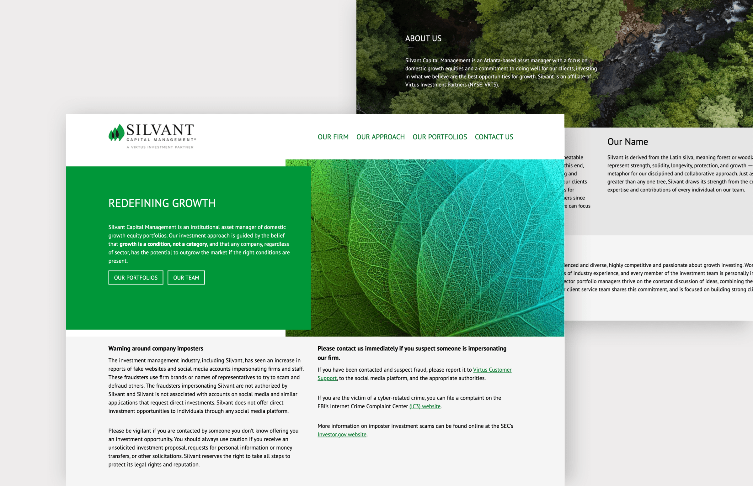
I redesigned the Silvant Financial website, an affiliate of Virtus Investment Partners, with a focus on creating a cleaner and more user-friendly experience. I worked closely with the development team to make sure the designs translated smoothly into the final build while still meeting technical needs. My work included redesigning page layouts, improving the overall site structure, and helping create a more cohesive visual style across the site.
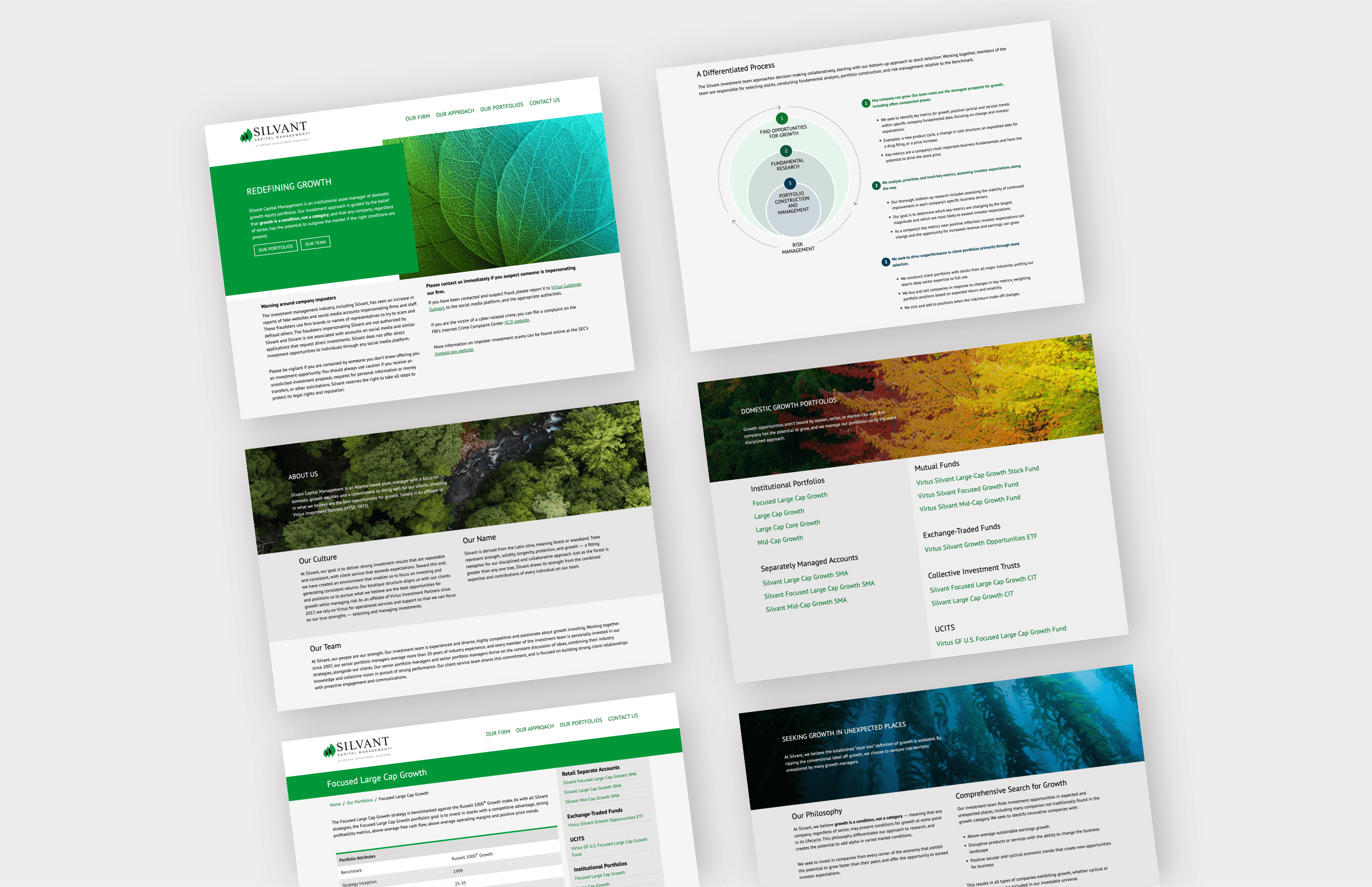
Throughout the project, I worked closely with several product managers to create infographics, organize content structure, and make sure everything stayed aligned with brand guidelines. A big part of the process was finding the balance between making information easy to understand while still keeping the pages visually engaging and clean. Since Virtus has multiple affiliate teams, I also had the opportunity to collaborate across different groups and make sure the Silvant redesign fit within the larger company standards while still feeling tailored to Silvant's audience and goals.
Project Purpose and Goal
Following the acquisition of Silvant by Virtus Investment Partners, the primary goal of the project was to centralize and elevate Silvant’s marketing and web presence under a unified strategy. As part of a broader initiative, we were simultaneously transitioning affiliate sites from KERN to Statamic CMS, which created a natural opportunity to modernize Silvant’s digital experience. The purpose of the redesign was not only to improve performance and scalability through a more flexible CMS, but also to ensure a seamless transition for all stakeholders involved—including Financial Advisors, Marketing Managers, and Product Owners—by prioritizing usability, clarity, and efficient content management workflows.
A key component of the project’s purpose was to balance innovation with brand continuity. Through extensive research into current trends in financial services design, we aimed to enhance the site’s visual and functional appeal while preserving the recognizable elements that existing users trusted. Maintaining Silvant’s signature earthy green color palette was a deliberate decision to support brand familiarity, while introducing a more refined layout, improved information hierarchy, and modern design elements. Ultimately, the project was driven by the need to create a refreshed, cohesive, and user-centered experience that aligned with both Silvant’s identity and the evolving standards of the financial industry.
Design Approach
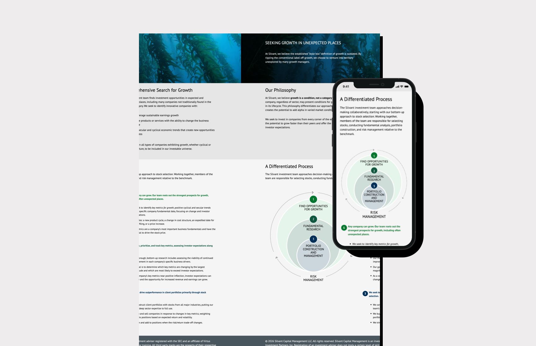
My design approach for Silvant started in Figma with low-fidelity page shells, then moved to higher fidelity as content models stabilized in Statamic. I prioritized scan-friendly layouts for advisory audiences: generous whitespace, a clear typographic scale for headings and body copy, and repeatable patterns for product tiles, disclosures, and calls to action.
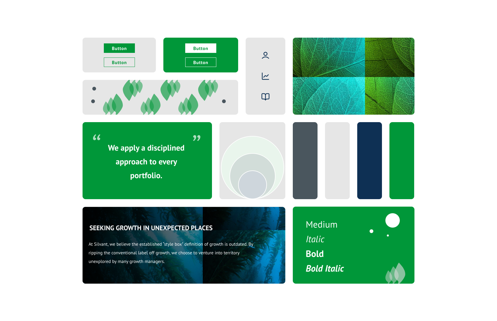
I iterated with engineering on breakpoints and CMS-driven components so marketing could publish updates without breaking the visual system. Infographics and iconography were simplified to align with broader Virtus patterns while keeping Silvant’s earthy greens as the anchor for recognition and trust.
Lessons Learned
This project taught me how to balance brand consistency with modernization inside a large financial organization. I learned to translate stakeholder feedback from product, marketing, and engineering into a cohesive interface system that stayed true to Silvant's identity while aligning with Virtus standards. It also reinforced the value of designing content-first, reusable components during a CMS migration so teams can publish confidently without breaking visual consistency.
More work
A few other projects worth a look.