Medical Student Portfolio
Timeline
November 2025, Research
December 2025, Design
January 2026, Beta Testing
My Role
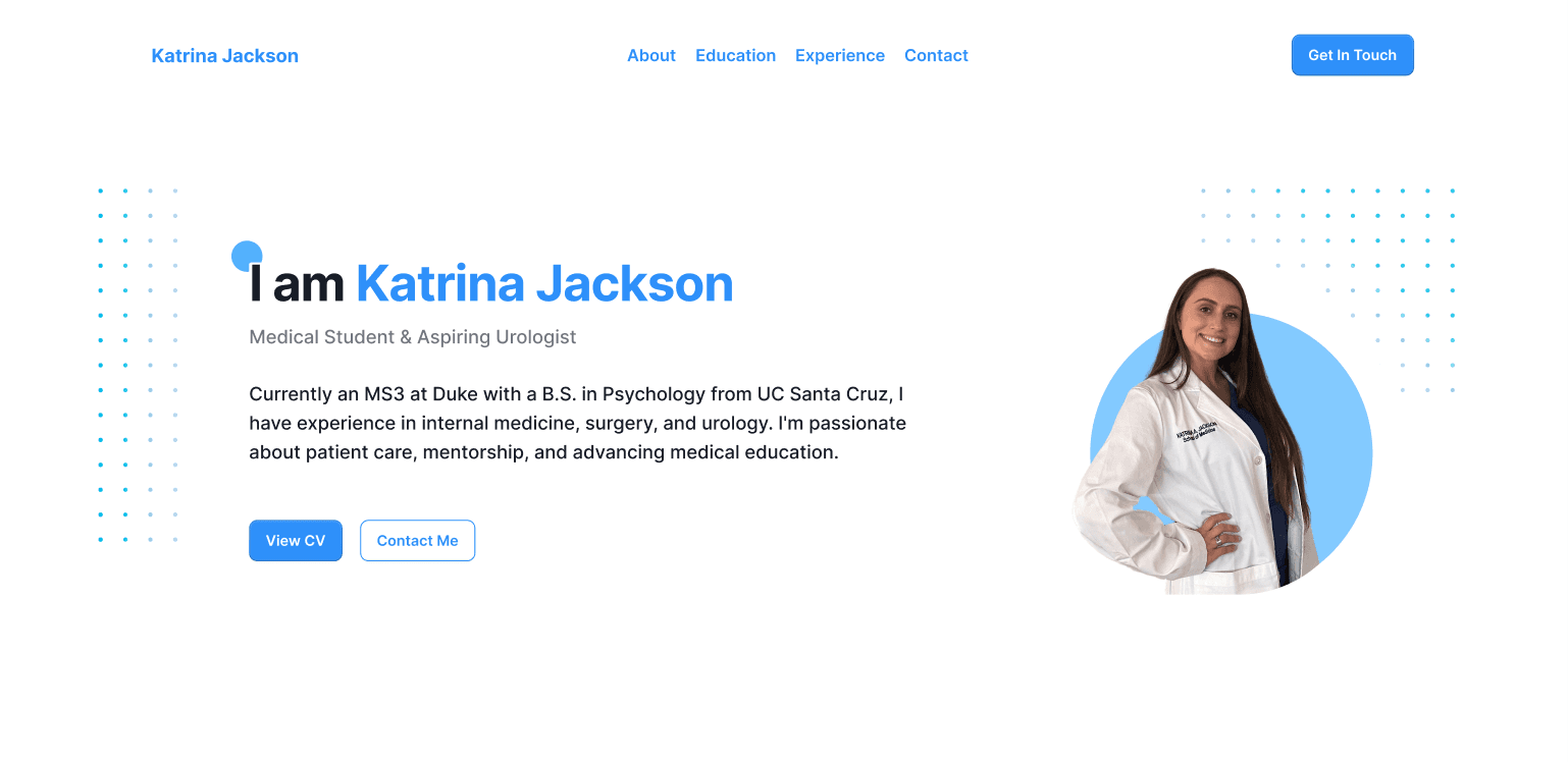
This is a residency-focused portfolio site for a medical student built with React and a Node.js development workflow. The design is clean and minimal, with a focus on highlighting the student’s experiences while also giving space for their personality and story to come through.
Project Purpose and Goal
This project was created to build a clean, professional portfolio site for residency applications that could showcase more than just a CV. The goal was to create a space where the student could highlight their experiences, publications, leadership, and personal journey in a way that still felt approachable and genuine.
Built with React and reusable styled components, the site was designed with consistency and scalability in mind while keeping the interface minimal and easy to navigate. Key sections include an About Me page, Experience timeline, and Publications section to organize academic and research work clearly.
Design Approach
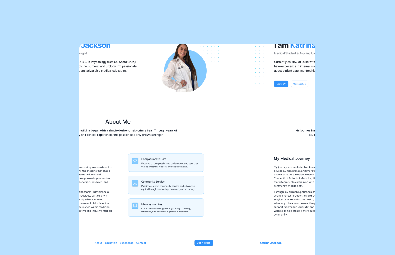
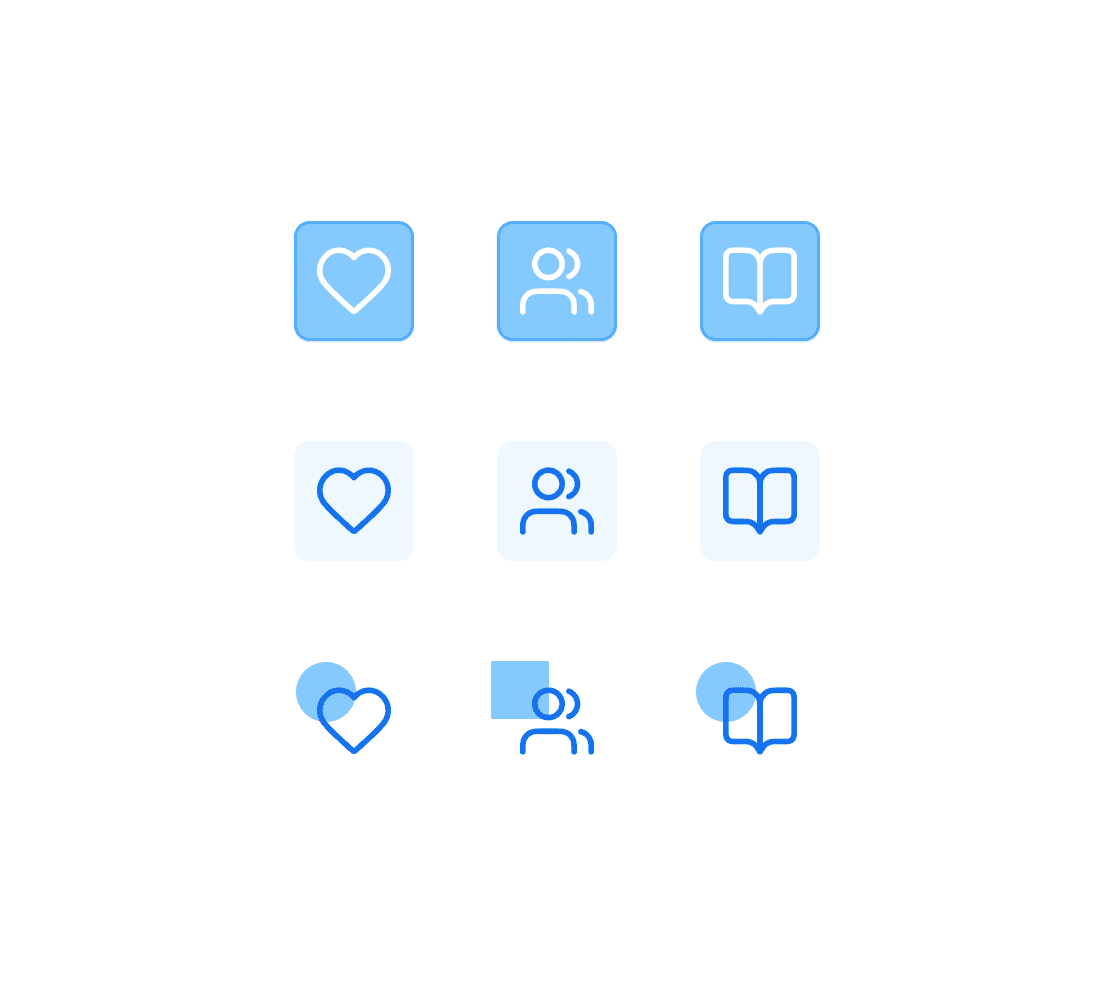
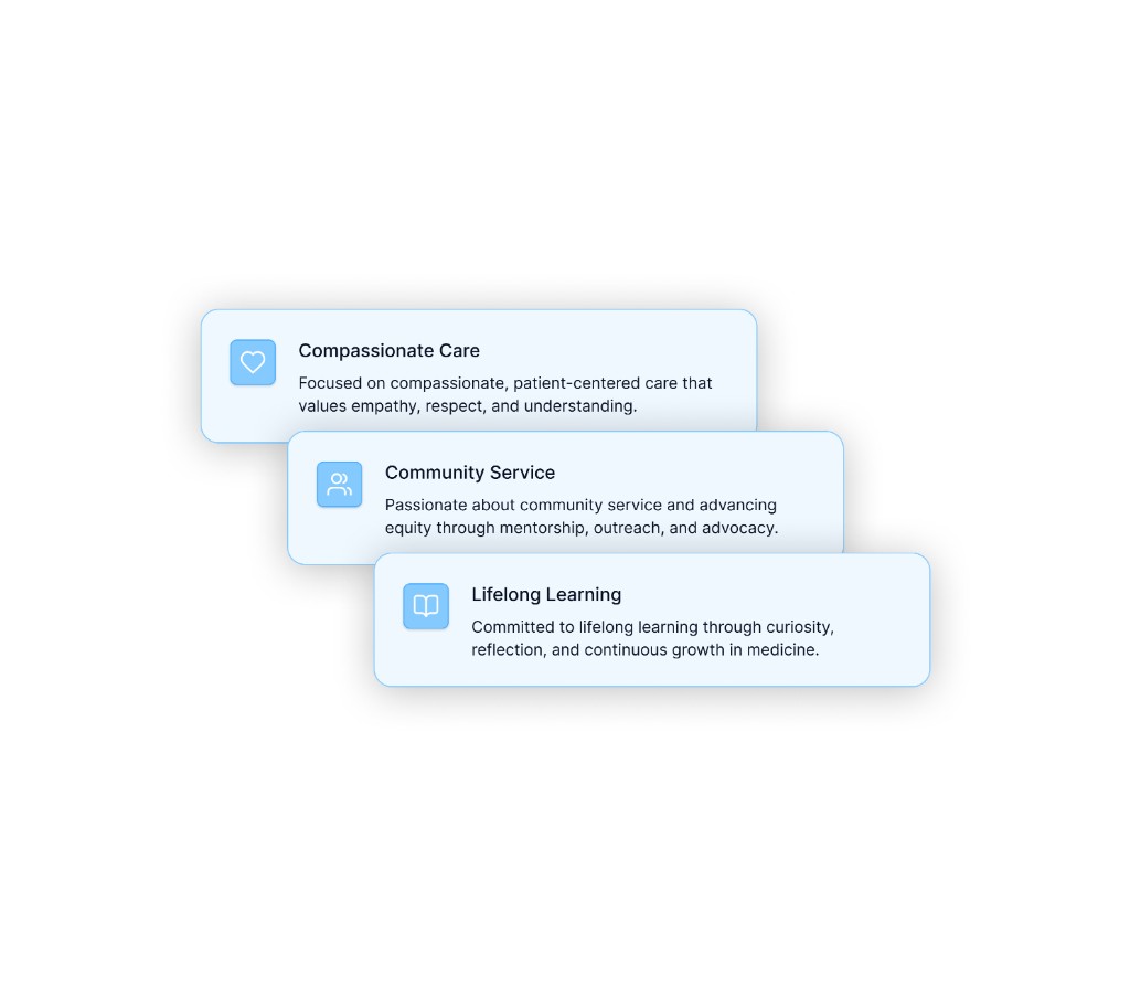
My approach to the design was to keep the site clean, organized, and easy to move through without feeling too rigid or overly formal. I used rounded, bubble-like shapes throughout the icons and headers to give the layout a softer and more welcoming feel. It helped make the site feel a little more personal while naturally guiding users through each section.
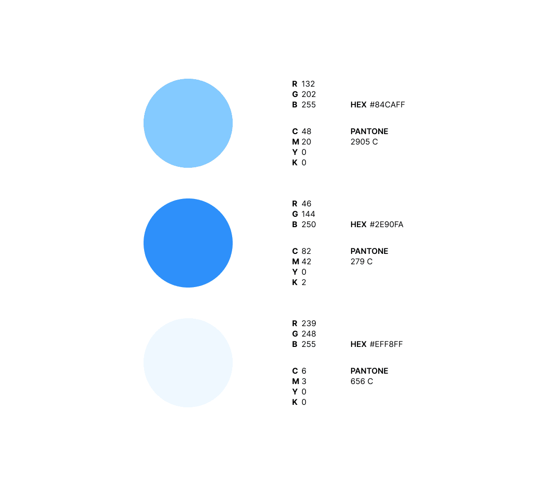
I also worked with different shades of blue to create contrast and structure across the page. Lighter tones help separate sections without adding clutter, while darker blues draw attention to important elements like headers and icons. The overall goal was to keep the interface modern and cohesive while still feeling simple and approachable.

Web Stack Explanation
For this project, I designed the interface in Figma using the Untitled UI design system as a foundation. From there, I created additional variables and expanded on the system with my own iconography and styling choices to better fit the overall feel of the site. I wanted the design to stay minimal and consistent while still feeling personal and polished.
This was also my first time using Cursor for a project, and I really enjoyed how much it improved the development workflow after finishing the designs in Figma. It made building and scaling components much more efficient, especially when translating the design system into code.
I chose React because its component-based structure made it easy to keep the UI consistent across sections like About, Experience, and Publications. It also allowed me to reuse components throughout the site instead of rebuilding similar layouts repeatedly. Node.js helped create a smooth development workflow and gives the project room to grow later on if features like dynamic content, forms, or integrations ever need to be added. Together, the stack felt like a good fit for a clean, scalable portfolio site.
Lessons Learned
First and foremost, this project was where I really learned how to use Figma and Cursor together in my workflow. I was also new to working with the Untitled UI design system, so I spent a lot of time learning how to create and manage assets, variables, and reusable styles within a larger design structure.
At first, I wasn’t sure how helpful Cursor would actually be while building the project in React, but it ended up being a huge help, especially when setting up the initial scaffolding and structure of the site. It made the development process feel much smoother and more efficient than I expected.
Honestly, the hardest part of the project was coordinating with the student and gathering all of the content and information needed for the site. I’m excited with how it’s coming together though, and hoping to have it launched soon.
More work
A few other projects worth a look.